
Category — zz. Even Geekier than Usual
Disney World and Coronavirus
WALT DISNEY WORLD IN THE ERA OF CORONAVIRUS
Last updated 3/22 11a EST.
Dear Niecelet 2.0:
I’ve been having fun helping you plan your May 2020 Walt Disney World visit with the Hubs and The Beast.
Then you asked me whether the Coronavirus COVID-19 outbreak ought to affect your plans, and then Walt Disney World announced it was shutting down Monday through the end of the month, and I stopped having fun.
My best guess is that limited operation will being no earlier than Monday May 4…
As you know, I have neither clinical qualifications nor epidemiology training.
But I do have a Twitter account, and from what I can see, that apparently qualifies me to pronounce on the novel Coronavirus, and the illness associated with it, COVID-19.
So here’s some thoughts…
CORONAVIRUS COVID-19 AND WALT DISNEY WORLD: THE BASICS
Last year the U.S. saw about 2.8 million deaths, and in February there were about 5.8 million unemployed.
What will the equivalent numbers be at the end of 2020? Well, that’s kind of up to you.
Take care of others. In the absence of perfect knowledge about your infectious status—which we will never have, as even if you were tested today, you might get infected tomorrow—the ethical thing to do is to act as though you have the disease. The central point is to maintain social distance, especially in settings when you will be with (relative) strangers.
The vast majority of folks who get the disease will recover after mild or unnoticed symptoms, but some folks—especially the elderly, and those with heart disease, diabetes, lung disease, or a compromised immune system—can be horribly vulnerable. (In South Korea, 89% of deaths have been from those 60 and older, and 97.4% of deaths from those 50 and older. China data, which is less complete, shows 81% of deaths from those 60 and older, and 94% of deaths from those 50 and older.) When you see others, you can’t assume that you know the vulnerability of either them or those they are in close contact with. So act as though you are infectious, and act as though those around you are at risk, by maintaining social distancing.
As much as possible, don’t separate yourself from the economy. If you spend less, other people take in less. Then they spend less. And so it goes, and the economy tanks, and a lot of people lose their jobs. Go to the movies if they are still open (while maintaining social distance). Spend some money. It’ll be OK. And if you have liquidity in your retirement plan, buy stocks. Don’t sell them—at your age (even at my age…) that’s what fools do. The rule is sell high, and buy low. Fools do the opposite.
There is much energy that has emerged over the weekend to “just stay home.” The death rate per million people–so far–ranges at the country level from around 2 deaths per million people in South Korea, to 2.3 per million in China, and to 80 deaths per million and rising in Italy. In an average year, each of these countries sees on the order of 7,000 to 9,000 deaths per million people. So the actual increment to what is typical is not a very large number, especially for China, which is pretty much done with the disease–at least so far…
Our policy makers are advising us more and more in the U.S. to just stay home as well. Where we diverge, pay attention to the policy makers, not your uncle!!
Of course if you are diagnosed, this all changes. If you actually have the disease, stay home unless a health care professional indicates that you are one of the 15-20% of people sick enough to be hospitalized.
Take care of yourself. The most important thing you can do is frequent, effective hand washing. There is much fussing about the shortage of hand sanitizers. Carry hand sanitizers (and surface sanitizers) if you can, but remember that soap and water, even cold water, when properly applied and properly scrubbed, is totally effective. Carry a bar of soap with you. Moreover, as you know from the fact that one of your extended family is immuno-compromised, when you have the choice, soap and water, when done correctly, is more effective than hand sanitizers.
One of the poignancies of the present moment is that heightened action led by panic is good for epidemics but bad for people’s jobs. Heightened panic that leads to a lot of extra social distancing, hand washing, and other measures protective of others or yourself will limit the impact of the pandemic at any given moment, reducing the burden of disease on our people and the risk of overwhelming our health care system. But panic as applied to economic activities does not have this positive result. It has really bad results. So find the line where you take care of both your health and the health and jobs of your fellow citizens.
And especially don’t panic over kids. Lotsa places are closing schools. That’s not because kids are vulnerable—unusually for respiratory diseases, they aren’t. None of China’s deaths into February were of kids. None of South Korea’s deaths through yesterday were of kids.
And it does not seem that kids even get the disease at particularly high rates, although there is contention over this. The Diamond Princess epidemiology—the only 100% testing regimen we may ever get on this disease—suggested that kids get infected at the same rate as everyone else. In contrast, simple algebra applied to the South Korea data suggests kids 0-9 years old get the disease at a rate of about 20 cases per million, or about one in 50,000 kids, while everyone else in South Korea gets the disease at a rate of about 171 per million, or about one in 6,000 folks 10 and older. However, the Diamond Princess was an artificial hothouse of infection, so a Bayesian would put the predominant weight of his or her prior on the South Korean data.
The issue with kids is their lousy ability to implement social distance, sneeze hygiene, and the like, especially around their grandparents. Removing them from mixing in masses with other kids in classrooms, school cafeterias, recesses, and buses limits their probably already low chance of getting the disease, which limits their chance of spreading the disease.
CORONAVIRUS AND WALT DISNEY WORLD: YOUR FAMILY AND SOME NUMBERS
There are some really silly numbers out there, mostly well-intended. Numbers that should be posed as “might be, based on the assumptions of our model, if there is no action by anyone” get converted into statements about what the future will be. And hardly anyone but professionals is framing their statements to the true probability ranges of their estimates—and some professionals aren’t even doing that.
Professionals need to model as best they can, even with limitations on present data and imperfect historical analogies. This gives them a range of possible outcomes if there is no material mitigation, and then also a range of possible outcomes after interventions of various degrees of effectiveness (interventions include not just what the government does, but also and much more importantly what you do—remember that what happens next is up to you).
They can then use their model outputs to persuade policy makers and the American people why they should do such things as encourage people to commit to social distancing, close schools, etc.
However, there are some problems with this. Many people—even the best analysts—are not as good as they should be at recognizing that when they are working with samples (either of data or of historical analogies), that the range of “all possible outcomes” is usually much wider than their samples would lead them to first think.
Another key other problem is that intrinsic to epidemiologic modeling are uncertain parameters and exponential curves of growth. Anyone who has ever built such a model understands how wildly sensitive they are to the assumptions used to create them.
That means that good models present such a wide range of possible outcomes that, to those who are not sophisticated on these matters, which is almost all of us, the results don’t appear credible. The uncertainty is real, and is a result of not bad modeling, but good modeling.
Finally, even good modeling can be communicated badly. That happened this week in Ohio. Amy Acton, M.D., the Director of Ohio’s Department of Health—who I think the world of, and am thrilled is leading Ohio’s efforts—said Thursday that “We know now, just the fact of community spread, says that at least 1 percent, at the very least, 1 percent of our population is carrying this virus in Ohio today. We have 11.7 million people. So the math is over 100,000. So that just gives you a sense of how this virus spreads and is spreading quickly.”
Many of those literate in math and the state of the disease elsewhere were immediately enboggled. Ohio has therefore more cases as China, which has been fighting this disease for months? Now, I know that China has particularly bad incidence reporting, but let’s say that there are four times as many people who got the disease as China as reported—that would put the number in China, a country of 1.4 billion people which essentially spent a month doing nothing, at 325,000. So Ohio, with 0.85% of the population of China, has 30% as many cases?
Friday she walked this back, saying “I am not saying there are absolutely for certain 100,000 people, I’m saying I’m guesstimating.” She also explained the analytics of her approach.
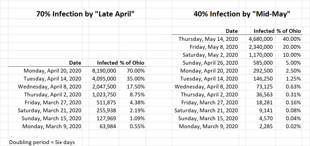
- She inferred from her conversations with many other experts that the estimated range of possible infections, if there was no intervention, was 40% to 70% of the population (you’ll see this many places, but all too often without the qualifiers “estimated” and “if there is no intervention”).
- She also inferred from many other experts that based on the timing of things in Ohio that “the peak would be in late April or early May.”
- She also inferred from many experts that the doubling period, with no intervention, was five to seven days, so she picked six days.
- She then—if I got her analytic approach right—did her math on the assumption that with no interventions 70% of the population would have the disease by late April, and cut this in half every six days until she got to March 9, which was the day she was trying to forecast.
I tried to replicate this analysis—assuming that I heard her correctly.
I got the result as being ~64,000 infected people on March 9, which is quite sensibly rounded to the 100,000 people she noted.
There’s (at least) one problem with this. The problem is that she did not articulate the uncertainty—that is the range of outcomes—of her own stated numbers. Using her same conceptual approach, but picking the two other terms she posed—a 40% infection rate with no interventions, and a mid-May peak—you get a very different answer: about 2,300 people currently infected.
But the biggest problem was the statement “We know now…that at least 1 percent of our population is carrying this virus in Ohio today.”
You can easily model the twelve scenarios that come from her three parameters (two peak dates times two peak rates times three doubling rates*).
And you will get from that work that she should have said not “we know that 1% of our population is carrying this virus today” but rather “the best model I have been able to put together predicts that there are between 300 and 120,000 people infected with this virus in Ohio today.” (The broader range comes from the other two doubling periods.)
That’s a tremendously uncomfortable range for those naive in the sensitivity of exponential models to initial assumptions. But it is probably in the neighborhood of the real uncertainty.
What does this mean for you and your family? Can I give you point forecast? Sure, but remember my qualification is a twitter handle, so take it with a huge grain of salt.
Countries well into this disease are showing a range of infections per million population from ~50 per million to 400+ per million.**
Reported infection rates are highly sensitive to testing rates, as a lot of testing will show many asymptomatic folks that will be missed from infection rates that include only limited testing (and presumptive cases from empirical diagnosis). So to fix an upper end—while making the math easier—let’s use an infection rate for the US of about double that of Italy, so 1,000 per million, or one in a thousand. So that’s your chance of getting the disease—assuming a lot of interventions by both us and those we chose to lead us, but with worse outcomes so far than others are getting.
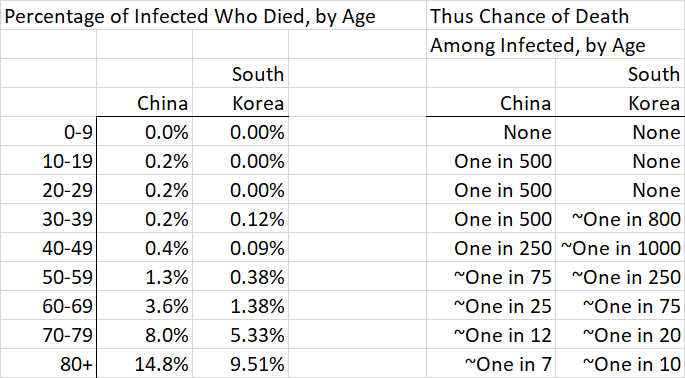
People the age of you and your husband have, in the data from China, about a 0.2% of dying, having gotten the disease, or one in 500. So my point forecast of your chance of dying from COVID-19 is the multiplication of the one in a thousand chance of getting the infection times a one in five hundred chance of dying from the infection once you have it, or one in five hundred thousand. Note that we have not lived with this disease long enough to know much about recurrence: the likelihood of its recurrence, the virulence of its recurrence, the periodicity or seasonality of its recurrence, and the impact of any new herd immunity that will exist during those re-occurrences. So your lifetime risk of death from it is likely to be higher than this.
Those of other age groups (and those with co-morbidities) face different odds. In China, no one the age of The Beast (zero to nine years old) died in the data set that covered through February. The data from Korea shows a much lower chance of death, and that from Italy, where the natural virulence of the disease among Italy’s vast proportions of elderly had been amplified by a collapse in the capacity of its health care system, a higher chance.
Here’s the Chinese and South Korean data, as a percent and expressed as chances of dying:
Another way to think about this. If you are under 60 you have hardly any chance of dying. If you are under 60 and have no major co-morbidities (heart or lung disease, or diabetes) then it’s even lower. So your goal is to prevent infecting those over 60, those with co-morbidities of any age, and those who might be in close contact with them. Which might be anyone…so back to social distancing.
Note that social distancing and other interventions have two different goals.
The first is to spread the burden of the disease on a population over time—thus reducing peaks. This has many positive outcomes, of which the most important is reducing the stress on the limited resources of our health care system. When we run out of resources—health care providers in general, healthy health care providers, protective gear, ventilators, respirators, safe spaces to treat people—more people die.
The second is ideally to reduce the total number of infections. Social distancing, reductions in mass gatherings, and reductions in smaller gatherings that include mixing of people who are not normally in close proximity (like school cafeteria lunches), and home quarantine for the 80% or so of people who are diagnosed but not ill enough to be hospitalized, limit the opportunity for person-to-person transmission.
While it’s pretty widely thought that we can “flatten the curve,” as it is called, from these mitigations, it’s not yet clear whether with COVID-19 we can actually limit the total number of people eventually infected. This is because it takes so long after infection for symptoms to first appear, and symptoms in so many who show them are so mild that they are not noticed. But time, even if it does not immediately reduce total infections, potentially buys us other things in addition to reducing the strain on the health care system. It lets the supply chain of protective equipment and sanitizers refill; it lets ill health care providers heal; it creates the opportunity for the virus to mutate into a less dangerous strain; it perhaps lets some herd immunity emerge.
So social distancing and other measures may or may not limit the total number of infections. What it will do—if people behave ethically–is spread the disease out in time. That—and testing—brings us back to Disney World.
CORONAVIRUS AND WALT DISNEY WORLD: TESTING
Walt Disney World, and to an extent the Walt Disney Company itself, are basically in the mass-gathering business. Think of Casey’s Corner, the tapstiles before rope drop, the stretching room at Haunted Mansion. Who woulda thunk that Disney+, conceived as a cord-cutting hedge, actually turned out to be a pandemic hedge….
My current best guess is that the only way Walt Disney World can operate while the virus is still a concern is by reducing and organizing its capacity to enable social distancing, and reducing its hours to enable overnight deep cleaning. You’ve probably seen this sort of thing already in movie theaters, where many have taken half or more of their seats out of capacity so that folks on average won’t be as close to strangers as they would have been otherwise.
This would require, I think, severe limits on entry to the parks to enforce a much lower total number of people in them, perhaps closure of some options where social distancing is hard to control (e.g. the afternoon parade at Magic Kingdom, the fireworks shows at Magic Kingdom and Epcot), and marking on the ground in the queues and waiting areas (like the pre-show areas) to indicate where groups should center themselves, so that social distancing from strangers is easy to do.
Other ideas being rumored are more use of Boarding Groups (apparently being re-named “Virtual Queues” and of course limits to the seating in table service restaurants and moving counter service restaurants to mobile orders only.
The other thing that would be of great advantage to Walt Disney World would be widespread testing that is available without a doctor’s order, that produced a dated certificate that could be displayed at the gates (and is hard to forge…). I actually hope for a day when we all wear lanyards containing a card that shows we were disease free at the time of testing, with color coding to indicate the date of testing. This would give people more courage to do the kind of things that would get the economy going again.
You could get most of the benefits from this by imposing a health check–a quick review of symptoms, travel history, and the taking of temperatures–at or before the security checks. A them park in Singapore has remained open with this approach. But that will miss the pretty high proportion of people with the disease who are asymptomatic (more than half in the Diamond Princess data, which is the only 100% sample there is).
There is, as you know, much nonsense being written about testing. Now let me be clear: more testing is better than less testing, and a lot of testing is better than some testing. But this is largely for economic, not clinical reasons, and people who confuse the two might be making foolish errors.
For example, I just saw a tweet—were it not my only qualification to be writing you, I’d be off Twitter entirely right now–that says “logic says we need universal testing but sadly that’s not happening.” Well, let’s spend a moment not being silly. South Korea, which has been universally praised for its testing levels, and held up to scorn us, has tested about 4,000 people per million population. That means that the universally praised South Korean model has NOT TESTED 99.6% of its population.
Or you see dangerous idiocies like this in an AP story about keeping the crisis from overwhelming hospitals, published a day or two ago: “How bad U.S. hospitals will be hit is unclear partly because bungling on the part of the government has left public health officials uncertain as to how many people are infected….Experts fear that when the problems with testing are resolved, a flood of patients will hit the nations emergency rooms.”
OK, let us not be silly. Testing has nothing to do with whether or not you go to an emergency room, and only a fool would suggest that it does. Just as with every other illness in the history of the universe, it is symptoms and risk factors that lead you to the health care system. If you have a fever, dry cough, or shortness of breath, call your primary care office. On that call you will be taken through your symptoms and medical history, and you will hear one of several next steps, depending on your differential diagnosis, the severity of your symptoms, and the presence or absence of other risk factors like age and key co-morbidities. These might include testing. They might include going to the emergency room. But they probably won’t, because most of us don’t have the disease, and of those that do, most don’t need to be hospitalized.
It is darling to listen to otherwise somewhat sensible reporters assume that if someone is not diagnosed via testing with COVID-19, they can’t be treated at all, as I did this evening with an NPR host. Our clinical professionals are not that stupid. If someone has signs and symptoms of respiratory distress, they will get treated for respiratory distress. If some is suffering from viral pneumonia, they will get treated for that. The cause is not a requisite to treatment. And if we are all wise enough to act on social distancing, that is, as though we carry the disease, then the presence or absence of an actual diagnosis matters much less.
What more testing, and more accessible testing, and more speedy results, could do is reduce the risks that others will be infected, and especially if results are visible, as in my lanyard notion above, they would improve the economy by improving the willingness of people to go back out into the marketplace.
More testing would yield more identification of those infected but asymptomatic, who could then be isolated at home and even more than social distancing limit their chances of infecting others; more visibility into who is demonstrably disease free (at least as of their testing date, which is why I suggested the date-of-testing color coding noted above) would improve the willingness of others to be around them.
Disney World may not be back in full routine operation until this disease has run its course—and that is more likely to be well after your May date than before your planned visit.
But it may be able to do a partial opening in April, with limited access and shorter hours (and some attractions not re-opened), so long as it can figure out a way to guide people to social distancing, e.g. by reconfigured queues, boarding groups, paint marks on the ground telling you where to center your party, etc.
Older front of the house cast members, and those with risk-creating co-morbidities, may need to be moved to the back of the house roles for their own safety, and some high-contact jobs—like the cast member in the Haunted Mansion stretching room—may not reappear.
After that, the return of Disney World—and the rest of the economy—to full operation may hinge a lot on how quickly more universal testing is available, as that is what will build confidence in people to be around strangers.
So what’s good for Disney World is good for the world…but the most important thing is that what is next is up to you.
*Since in her analytic approach, the beginning and end dates are fixed, changes in days-to-double changes the number of doubling periods. More doubling periods means fewer cases today, and fewer doubling periods means more cases today.
**Yes, I know that it is much higher in the worst-affected areas. But as a Bayesian I would start with my prior as the national rate, and then revise it up or down based on material local factors. On average across the US this is an OK place to start. The key here to keep your eye out for is if, rather than the disease disappearing from China, as it has been for weeks, if it flares up again to Wuhan levels in a new geography. That would demonstrate a much more dangerous illness.
SOME SOURCES
China data
South Korea data
Testing rates per million
Infections per million

Follow yourfirstvisit.net on Facebook or Twitter or Pinterest!!
March 15, 2020 2 Comments
Analysis of Disney World’s 2020 Ticket Price Increase
Earlier in February, Walt Disney World increased its ticket prices for 2020. Since then, I’ve spent most of my time on ticket prices getting my Disney World Tickets page and my color-coded Disney World ticket price calendar right.
In this post, I will be commenting on the level of increases, and also how they flow in the year.
2020 prices were first released in June 2019, and I always expected at least one more increase in 2020 prices—for two reasons.
- First, for years now, Disney World has increased prices for the current year in the late winter, typically February, and
- Second, the 2020 prices released in June of last year went up on average only about 2% compared to 2019 prices. Given recent patterns in price increases, there’s no way Disney World would have left this stand
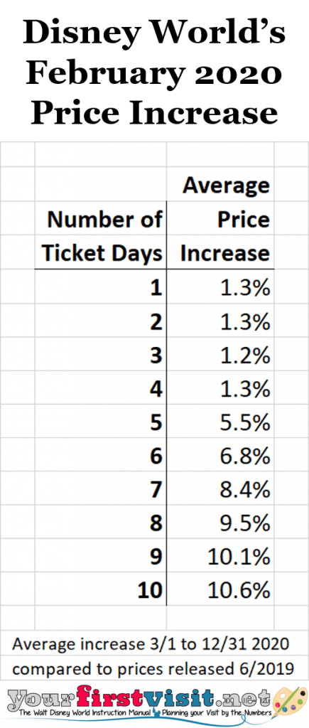
2020 DISNEY WORLD TICKET PRICE INCREASES BY TICKET LENGTH
Base Disney World tickets can be bought for between one and ten days in the theme parks. With the February 2020 price increase, prices for longer tickets in 2020 increased substantially more than prices for shorter tickets. Shorter tickets went up on average less than 2%, while tickets seven days and longer went up 8.4% to 10.6%.
It’s easy to over-interpret this. For example, you could say that people wandering in for a quick sample of the new offerings in Galaxy’s Edge aren’t much penalized, but folks on a longer vacation trying to see all of Disney World bear an extra burden. This is absolutely true, but that does not mean it was Disney’s intent.
It was widely reported after the February ticket price increase that both the least and most expensive one day tickets did not change.
This is simultaneously true, trivial, and simple-minded. Hardly anyone buys one day tickets. What these tickets represent is the price anchor of longer tickets, whose prices are calculated as a proportion of the sum of the one day tickets covered by the usage period of the longer tickets.
What Disney essentially did for longer tickets was change the proportions used to calculate their prices. That let it get some positive PR from the simple-minded for not increasing the lowest and highest one day tickets–at which point the analytic savvy of most observers stopped–while also extracting substantially more value from folks committed to longer visits.
Two things remain generally true: because you are not penalized for adding days to a ticket (so long as you add such days before your last day of use) it never pays to overbuy your tickets. Buy the minimum ticket you think you night need, and only add more to it after you are in the parks and know you need your extra days.
Second, it remains true that the per day cost of longer tickets is almost always lower than that for shorter ones. So one longer visit is still largely much less expensive than two shorter visits.
Now let’s turn to how these price increases vary over the remainder of 2020.
2020 DISNEY WORLD TICKET PRICE INCREASES BY TICKET LENGTH AND DATE
This section includes two charts. The first one shows price increases by first day of eligible use for every ticket length—so it plots more than 3,000 percentage changes:
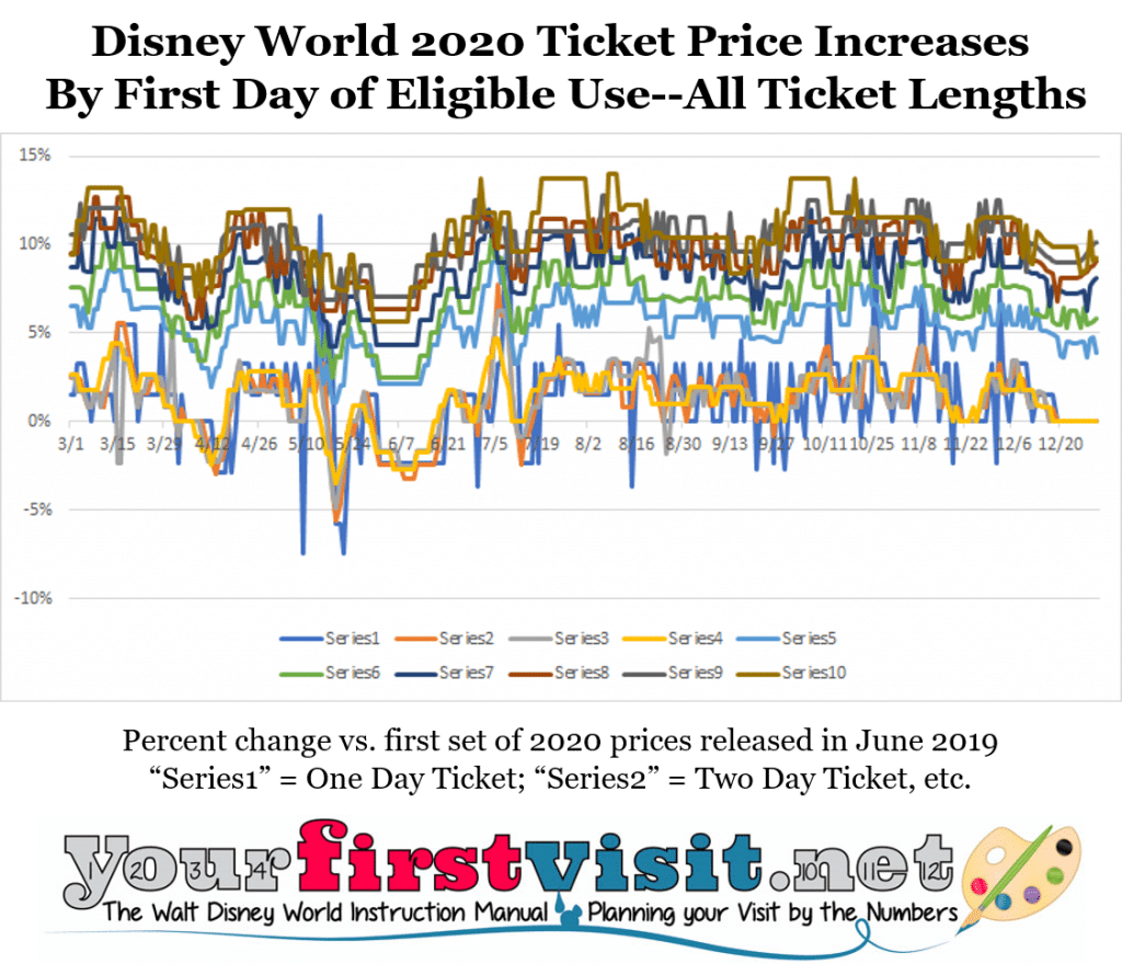
For many of you, there’s too much data plotted on the chart to see much information.
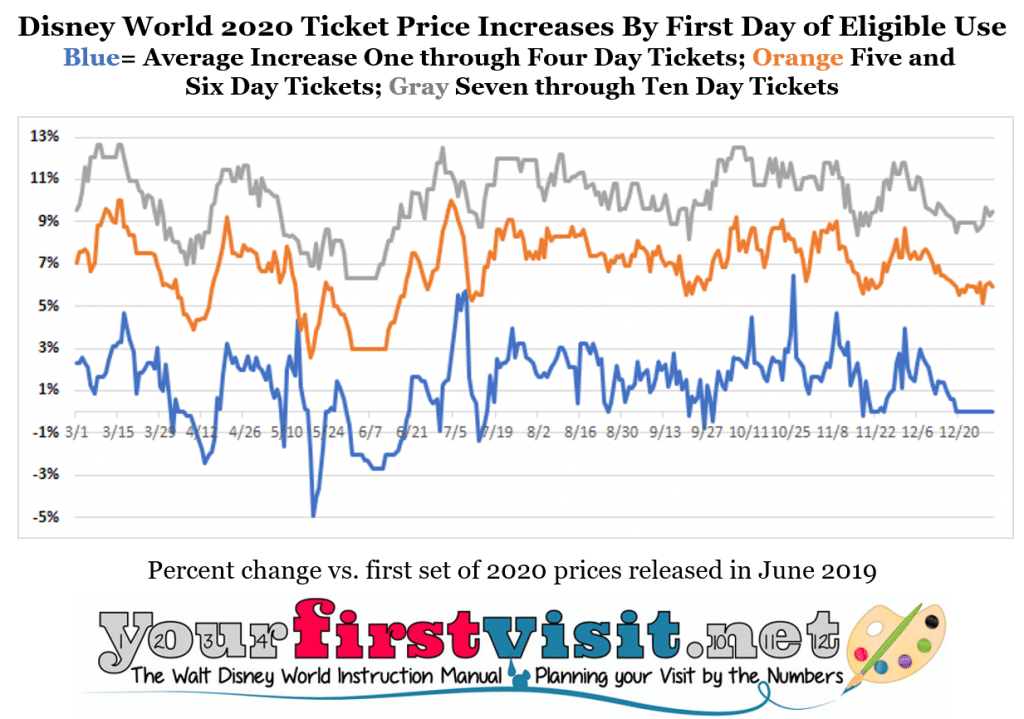
I tried to make up for this in the second chart, above, by grouping the average price increases of three sets of ticket lengths—one to four day tickets, which all saw less than 2% average increases; seven through ten day tickets, which all saw average increases of over 8%, and five and six day tickets, about in the middle of the other two.
One thing that distinctively stands out is that there is less variability in price changes after mid-July. Visually, this means that the ups and down of the price increases cover less of the vertical space of the chart. Analytically, the standard deviation of price increases, as a percentage of the mean, is twice as high before July 15 than it is after July 15.
There’s at least two possible explanation for why we see lower variance after July 15. One is that Disney–in its judgement–got relative prices among the dates after 7/15 closer to correct. The other is that Disney does not have enough information now to make fine grained adjustments later in 2020 the way it has done earlier in the year–you can see example of these finer grained adjustments in May, for example.
Since–despite the advice of folks like me–most Disney World trips are planned three months out or closer, my vote is for the second explanation. Note that this increases the odds of a second price increase, affecting these dates, perhaps in the summer when 2021 ticket prices are announced.
Remember that Disney’s date based ticket price model has two purposes.
- First, it intends to use prices to incent people towards dates less in demand, and away from dates higher in demand
- Second, it seeks to extract the extra value from high demand dates that’s on the table from those who go during high-demand periods anyway
Unless fine-grained visitation patterns are highly stable, these purposes present a strong case for multiple price changes over the course of the year, not the one (or rarely two) that we are used to at Walt Disney World.
Note that once you have bought your tickets, so long as you don’t make any later changes, you are free from the consequences of future price increases that would otherwise affect your dates.
The long-time travel agent partner of this site, Kelly, can set up your Disney World vacation for you, locking down your prices, including those of your park tickets. Contact her using the form below!
Analytic note. My percentage changes are based on comparing rounded per-day prices rather than complete-to-the-cents actual total prices—I do it this way because with more than 3,000 new prices to enter into my spreadsheet, it cuts data entry time by about 75%. This can add noise to the data at the level of 0.5% to 2% on any given data point, but the rounding errors it creates average out over the number of days I am looking at.
Follow yourfirstvisit.net on Facebook or Twitter or Pinterest!!
February 23, 2020 2 Comments
The Skyliner Price Premium: ~$60 Million in 2020
I’ve been curious as to what the premium might be for the Skyliner resorts in 2020–partly as a guide to what Disney sees the incremental value of the Skyliner to be, and partly to illuminate the question about whether bus service will continue at these resorts.
(The Skyliner resorts are Disney’s Caribbean Beach Resort, Pop Century Resort, and Art of Animation Resort. These will all be served by a new gondola system that will connect them to two of Disney World’s theme parks, Disney’s Hollywood Studios and Epcot. The formal opening of the Skyliner has been announced to be September 29. Disney’s new DVC offering, Disney’s Riviera Resort, will also be on the Skyliner when it opens in later December, but is has no material 2019 prices for comparison.)
 I’ve heard glib lines about this on podcasts, e.g. that “the Skyliner resorts will be $10 to $20 more,” but no percentage increases, nor comparisons of the full year of 2020 vs 2019.
Because every year I do charts like the below (from 2020 Disney World Resort Hotel Price Seasons) I have daily price data for 2020 vs 2019 for standard view rooms at all the Skyliner resorts.
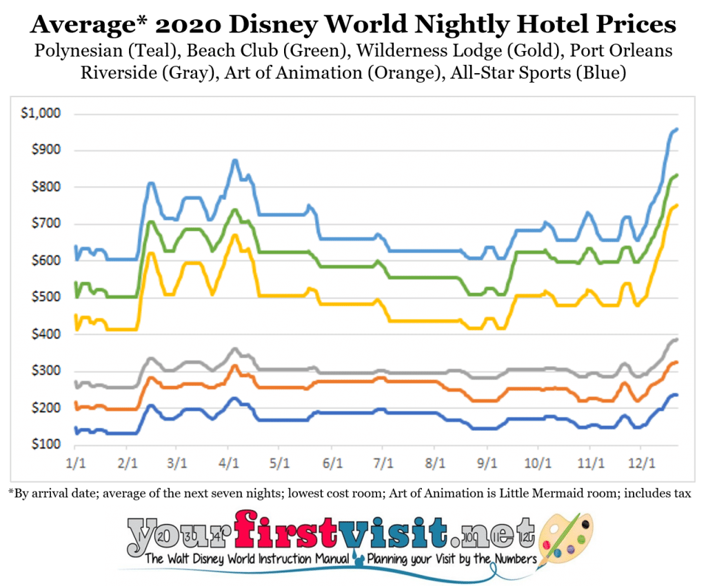
So from this data I can calculate what it would cost to stay every night of 2019 and 2020 in one of these rooms, and from that (adjusting for the 2020 leap year) figure average nightly costs over the year, and changes year to year in that number. (I’ve also checked most or all of the higher priced room options at these resorts (see the note at the bottom of the page) and they all follow the same pattern).
So here’s the basics:
- Skyliner value resort Pop Century standard room average 2020 prices are up 20.1% compared to 2019, and increases at Skyliner value resort Art of Animation spaces are similar–Art of Animation Little Mermaid rooms are up 19.6%, and Art of Animation Family Suites are up 18.9% for Lion King and Cars suites, and 19.2% for Nemo suites. Meanwhile, prices at the non-Skyliner All-Star value resorts are up “just” 6.5%. There was already a substantial price gap among these resorts, and after the disparate price increases, Little Mermaid rooms are now ~$80 more, on average, than All-Star rooms, and $40 more on average than Pop rooms.
- Skyliner moderate resort Caribbean Beach standard rooms went up on average 20.7% for 2020 compared to 2019. Other room types had similar increases. Non-Skyliner moderates Coronado Springs, Port Orleans Riverside, and Port Orleans French Quarter went up 9.4%, 8.4% and 8.4% respectively. The price premium between the Port Orleans resorts and Caribbean Beach on average over 2020 has almost disappeared, and Coronado Springs is now on average about $20/night less than the other three traditional moderate resorts.
The total 365 day price increase for 2020 for the three Skyliner resorts at 100% occupancy is about 19.7% compared to 365 days in 2019, which translates into more* than $117 million.
If you just use the $117 million figure, and then deduct from it what the other values and moderates went up in total for 2020 (about 6.5% and 8.6%, respectively)—on the premise that without the Skyliner, the Skyliner resorts would have gone up about this much—then you get about $75.5 million.
If you take 15% of this off for occupancy being below 100%, then you get to about $64 million. If you take 10% more off for various discounts and deals across the year, then you get to $58 million. For the reasons explained in the note at the bottom of the page, I know I am actually low in my numbers at Caribbean Beach and Pop Century, so I round this up to $60 million.
So that’s my answer for the value Disney World will gain from the Skyliner resorts–about $60 million a year in new top line revenue.
You will find online a vast number of claims that “the Skyliner is being done to reduce bus costs, so don’t expect buses on these routes at these resorts after it opens.” Well, the revenue premium for the Skyliner would pay for on the order of 1,200 full time bus drivers. Since it takes by my back of the envelope estimates about 20 full time equivalent bus drivers to cover each of the three resorts’ Epcot and Hollywood Studios routes, I’m not entirely sure that the ROI of this project depends on eliminating bus service and 60 jobs.
But I suppose we will see. Disney World has shown remarkable propensity to nickel and dime on costs while implementing vast price increases.
*At Art of Animation, I modeled all three bookable types, so my number here—just over $50 million–is pretty exact. At both Pop Century and Caribbean Beach, I multiplied the price increase for lowest cost rooms across all rooms of every bookable type. I did this because I don’t have a good source for the number of rooms in each class, especially for Caribbean Beach, which has eight bookable room types. (I did check cross a sample of price seasons for all bookable Pop rooms, and most bookable Caribbean Beach rooms, to confirm that they also saw a comparable ~20% price increase—they did.) The numbers for Pop (~$38 million) and Caribbean Beach (~$29 million) are thus low.
The long-time travel agent partner of this site, Kelly, can help you book–or avoid!–one of these Skyliner resorts. Contact her using the form below.
Follow yourfirstvisit.net on Facebook or Twitter or Pinterest!!
July 30, 2019 5 Comments
Updated 2019 Disney World Crowd Forecasts and Week Rankings
I’ve just revised my 2019 Disney World Crowd Calendar, and–because crowds are a big part of it–also my 2019 Disney World week rankings.
These revisions were based on two things—the partial opening of Star Wars on August 29, and my new information on actual 2019 fall breaks.
Weeks affected by forecast crowd level changes were those starting 8/24/19 (the week of the partial opening) through 10/26/19. The opening date for the rest of Galaxy’s Edge, once announced, may require me to revise the later among these, and the later weeks of 2019, yet another time.
The basic approach I take to crowd forecasting is Bayesian:
- I use my knowledge of how crowds have varied over the course of the year to set my priors—I’ve been doing this for a decade now, so have a pretty good set of priors.
- I then gather new, relevant, future-oriented information, apply judgment and parallel examples to it, and then as needed revise my priors.
April 22, 2019 No Comments
Analytic Calendar of 2019 Disney World Ticket Prices
I’ve color coded the start dates of the various base ticket lengths in Disney World’s new date-based ticket pricing system to indicate less and more expensive ticket dates in 2019, beginning in April and compared to available prices the rest of 2019. The prices I show are pre-tax, per ticket day, and rounded to the nearest dollar.
In what follows, basically
- The more and the darker the green, the better
- The more and the darker the red, the worse.
Dates with black text on a white background are everything else–you can think of them as “typical” or “average.” The technical details on how I color coded are at the end of the post.
APRIL AND MAY 2019 DISNEY WORLD TICKET PRICES
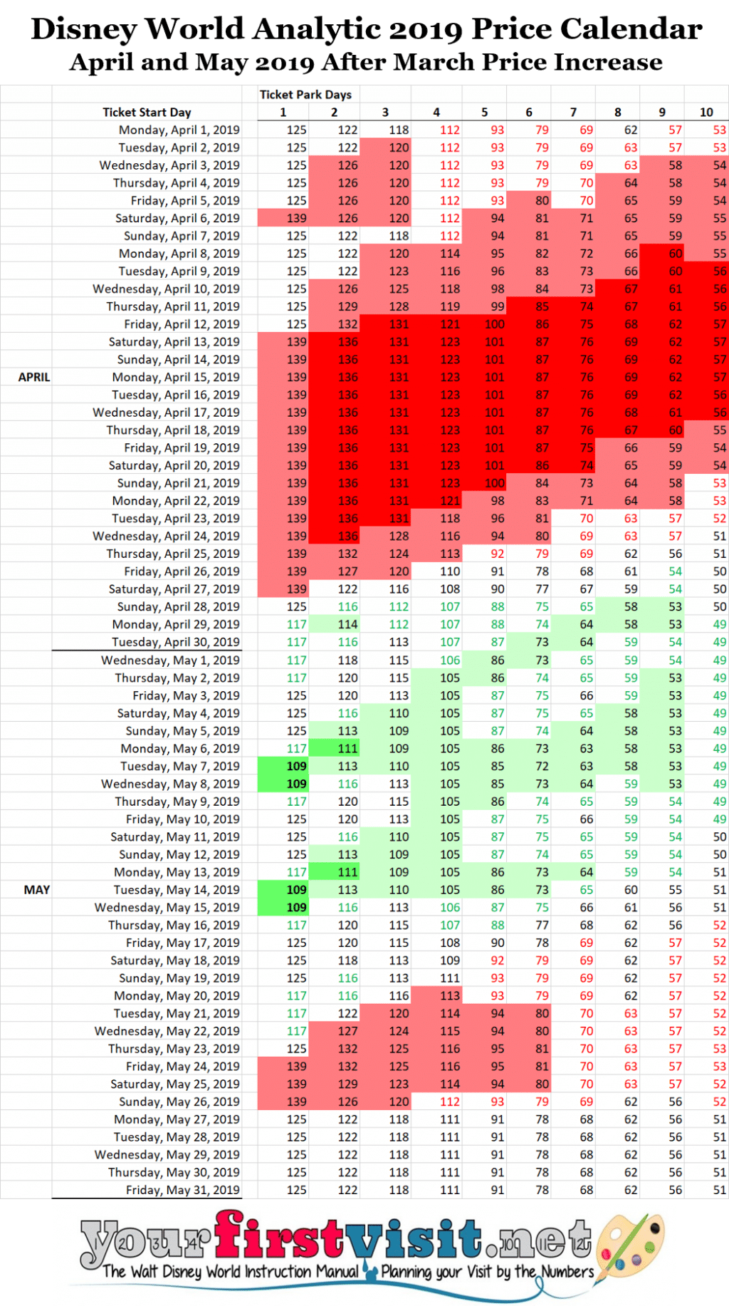
April ticket prices peak for the popular spring break periods before and after Easter, and for the longer ticket lengths are red most of the month.
The first half of May shows much lower prices, and then prices start going up to cover the Memorial Day weekend, then go down to average levels after.
JUNE AND JULY 2019 DISNEY WORLD TICKET PRICES

June ticket prices are largely average. July sees some higher prices for shorter tickets keyed to the Fourth of July, then a mix of average and slightly lower prices the rest of the month.
AUGUST AND SEPTEMBER 2019 DISNEY WORLD TICKET PRICES
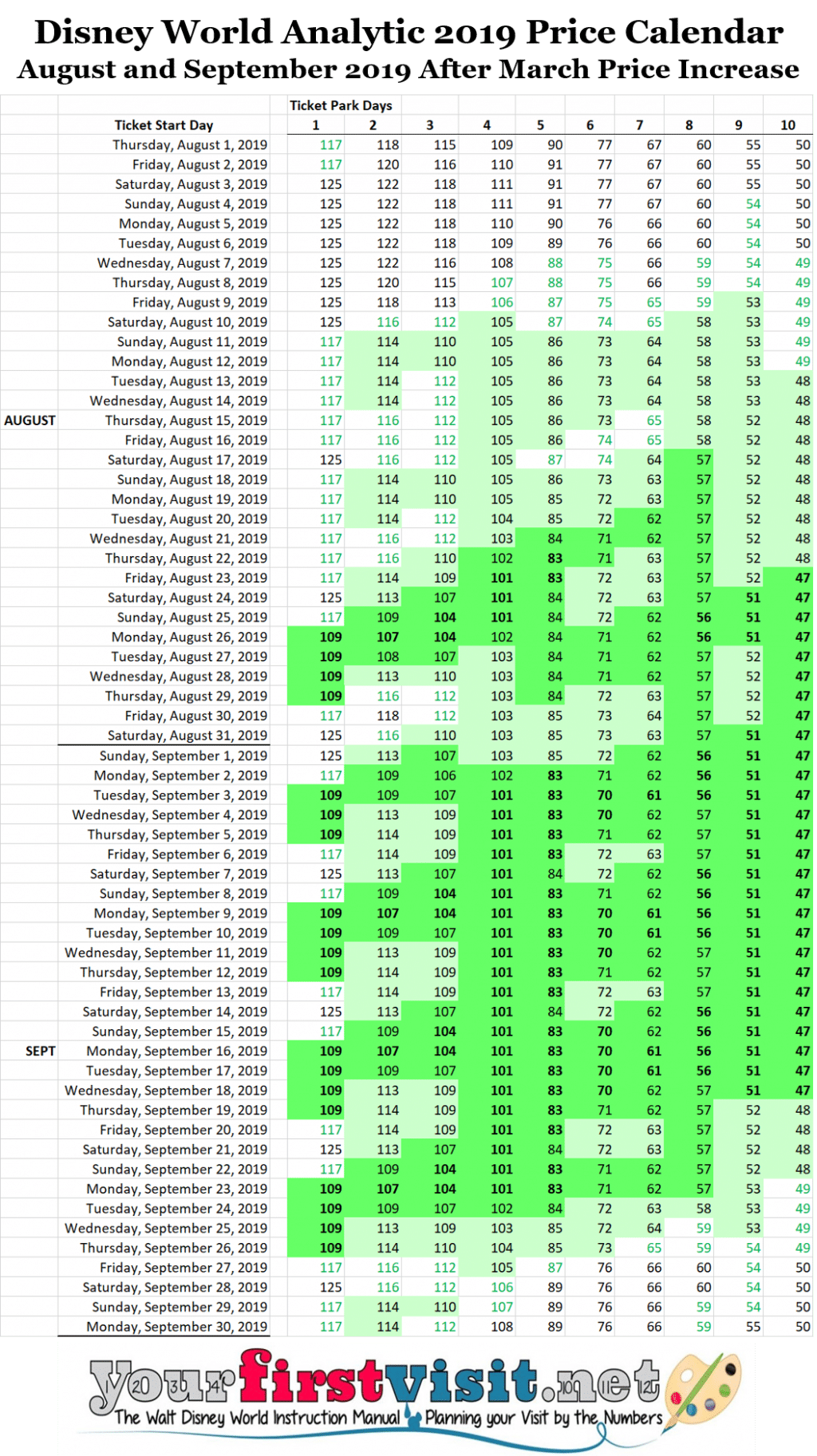
The first week of August has average ticket prices, then lower prices become more dominant. September is filled with lower prices until late in the month.
OCTOBER 2019 DISNEY WORLD TICKET PRICES
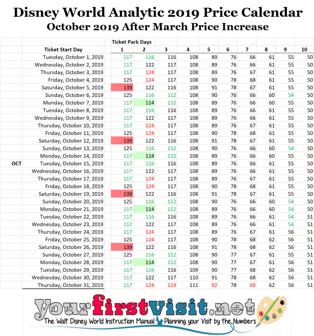
Except for the very shortest ticket lengths, which bounce around, October sees almost entirely average ticket prices.
NOVEMBER AND DECEMBER 2019 DISNEY WORLD TICKET PRICES
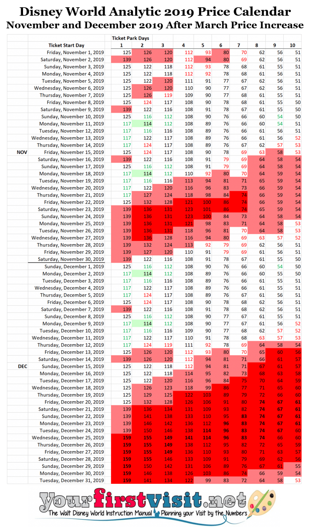
Early November sees some curious higher ticket prices in the shorter tickets. After that, prices are largely average until they go up for Thanksgiving.
The first third of December has largely average prices, and then ticket prices start going up for the holidays, hitting their highest levels of the year in the last third of the month.
TECHNICAL DETAILS OF COLOR CODING
- The lowest of the 9 months April-December for that ticket length have green fill and bolded black text
- Ticket prices approximately in the bottom 10% have green fill and black text
- Ticket prices approximately in the next lowest 10% have a lighter green fill and black text
- The next approximately 10% of higher price level dates has white fill and green text
- Dates with prices approximately in the 70th to 80th percentile have white fill and red text
- Prices approximately in the 80th to 90th percentile have a light red fill and black text
- Prices in roughly the top 10% for the year have a darker red fill and black text
- The highest price of the year for that ticket type has darker red fill and bold black text
- Every other price in between has black text and white fill.
Note that all my work is based on the rounded prices Disney published and are pre-tax. As a result, the “10%” breaks are not exact.
Follow yourfirstvisit.net on Facebook or Twitter or Pinterest!!
October 23, 2018 6 Comments
Updated Disney World 2019 Price Seasons
Yesterday I published my updated material on Walt Disney World resort prices in 2019, based on my sampling (and analysis) of more than 3,200 individual hotel/date/price combinations.
The purpose of this site is to help people make better choices in their Disney World vacations, either from direct advice or from providing the facts and letting people make their own decision from them.
Disney resort hotel prices matter because the exact same room can cost 75% more depending on what nights you stay in it.
To help guide people around this without getting into the more than 30,000 individual pieces of data, my 2019 Disney World price seasons material first is a sample of half of Disney World’s hotels, and second analyzes and depicts only the least expensive room types within them.
I then show the results in two ways: charts that smooth out the changing prices by averaging prices over a seven night stay, and “invented” (I’ll return to this in a minute) “price seasons” that give a broad sense of how expensive a room is during different parts of the year. In my “seasons” I always express prices as how much higher they are than the lowest prices for that room that year.
In this post I want to explain a little about why I do it this way—and where the seasons came from. But if you don’t care and just want to see the results, go here; if you want to see every single data point, go to MouseSavers.com here.
NIGHTLY ROOM RATES
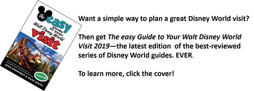
 Here’s a chart of the actual rates by night in 2019 of a standard view rooms at Disney’s Beach Club resort. Note that I have truncated the lower axis at $450/night to make the patterns more readable.
While you’ll note some consistency over periods (this is where “price seasons” comes in), there’s a lot of wiggles in the line. This comes from all the different prices during the week that Disney now charges, as well as various holiday weekend upcharges.
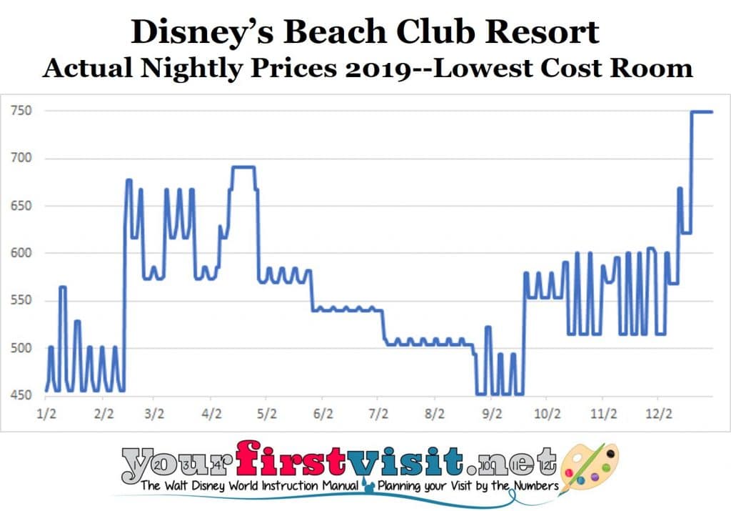
The net is 38 different prices for the same room over the course of 2019. In this chart, I have a straight line across for each of the 38 prices:
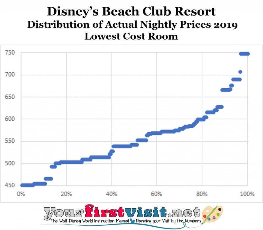
 …and in the chart below, I show the distribution of prices for this room. More than half of the nights of the year, you can get this room for $550 or less, but 20% of the nights of the year you will pay prices of $600 or much more (all my prices include tax).
 To make these price shifts a little easier to understand, I smooth them out. My smoothing approach is to average prices over seven nights—the check in night, and six more. This is what I display on my 2019 Disney World price seasons page. I pick seven nights to map to the set of prices that vary over the week but are the same the next week characteristic of many Disney World price seasons.
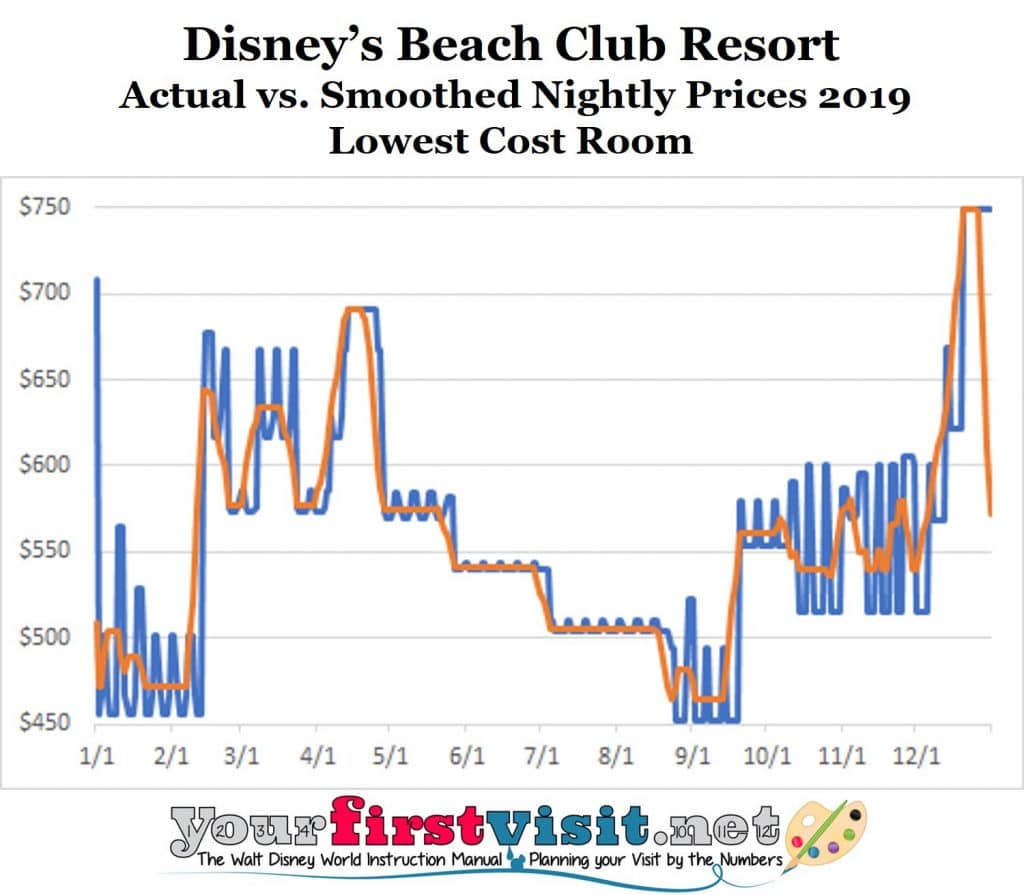 This chart shows the smoothed line (in orange) on top of the actual prices in blue. I believe that this type of smoothing makes it much easier to interpret what prices you will run into for any check in date.
DISNEY WORLD PRICE SEASONS
Disney World used to group and label periods of the year into resort “price seasons.” The traditional price season calendar would have a day or two of peak season in early January coming out of the holidays, then shift into value season, then peak again for Presidents Day week, then regular season, then a mix of regular and peak during spring break before Easter, then Easter season, in years with an early Easter some more peak seasons, then regular season, then summer season, etc.
Last year, Disney stopped labeling the parts of the year into price seasons, and added more distinct price points over the course of the year. For 2019 it continued to abandon the “season” labeling concept, and added even more distinct prices. (I’ll publish more on 2018 vs. 2019 resort prices later this summer.)
But you can still see price seasons, if you look closely enough.
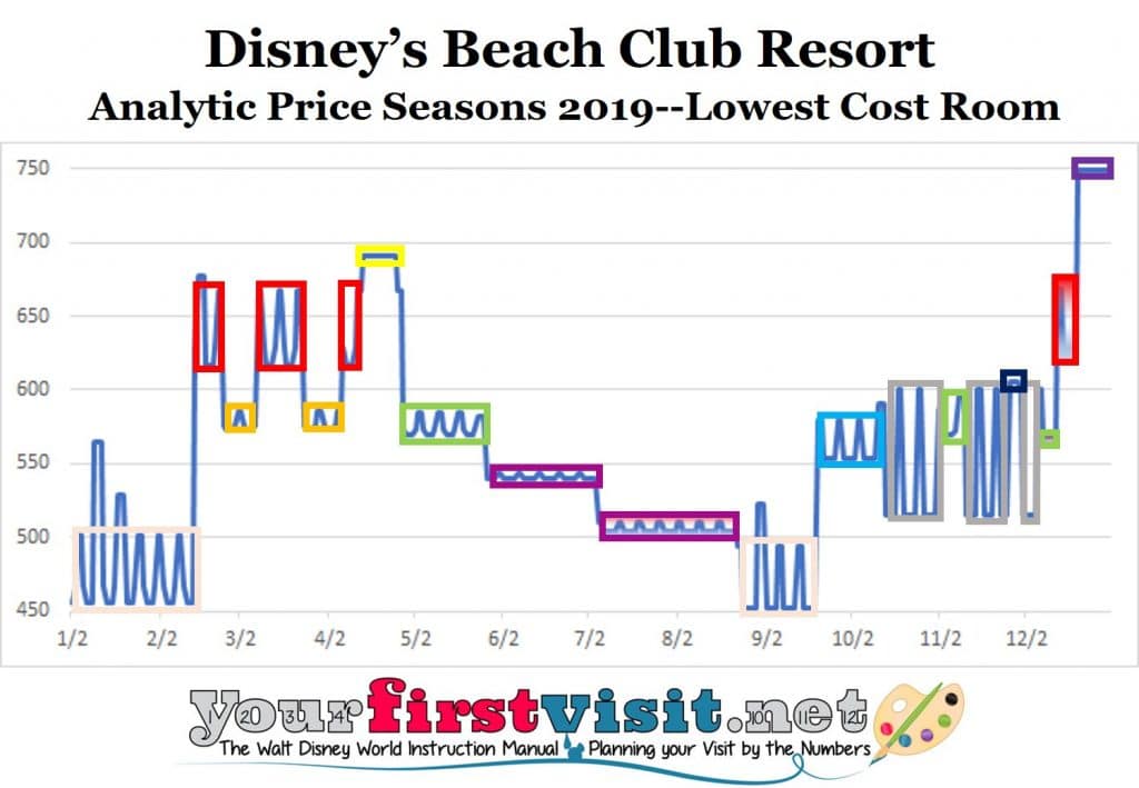 See the chart, where I have used colored boxes to group prices into seasons (ignoring holiday weekend upcharges), keeping the same color when the numbers remain the same. I have then labeled these with the traditional names—although my labels don’t always correspond to those used by MouseSavers.com.
The first box in January, in light orange, is the value season. Then we have a sequence of peak (red) and regular (orange), culminating in the Easter season in yellow. A distinct season then opens, which I call regular 2. After that are two distinct summer seasons, then the value season reappears in late August and early September.
Things then get a little confusing, but based on both this and the same charts for other deluxes, I basically see a sequence of regular variants (in blue and green) that I call regular 3, regular 4, and regular 5, alternating with the Fall season (grey) in between, interrupted by the Thanksgiving upcharge in black. Later in December peak season returns, and then we skyrocket off into the holiday seasons.
This then is the set of seasonal labels I use in my text descriptions of the 2019 Disney World resort price seasons.
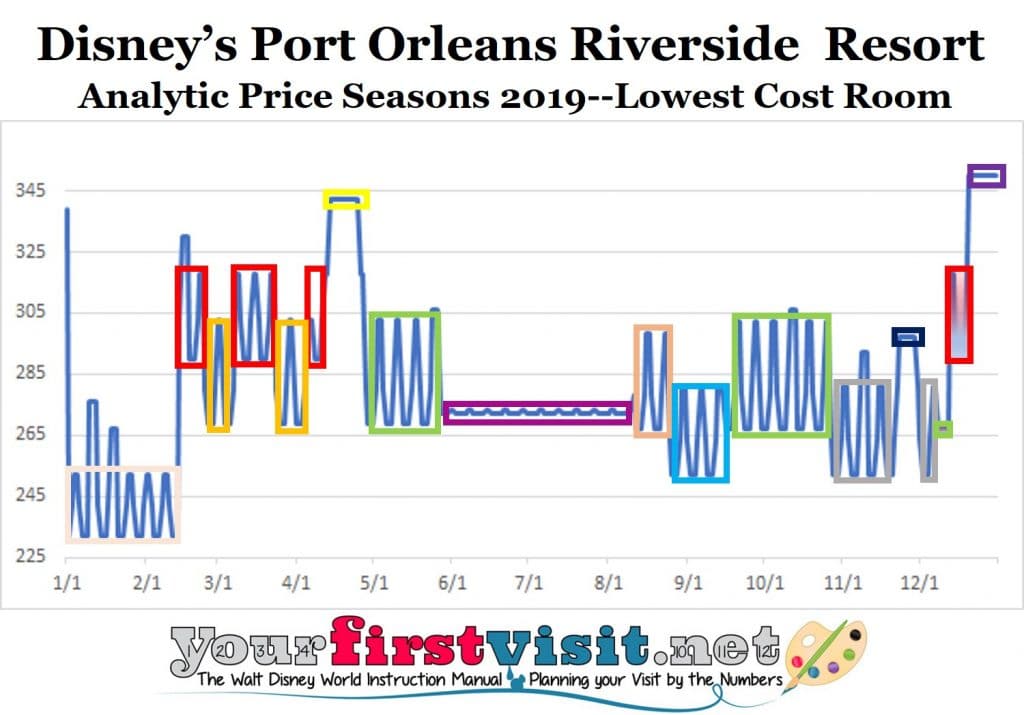
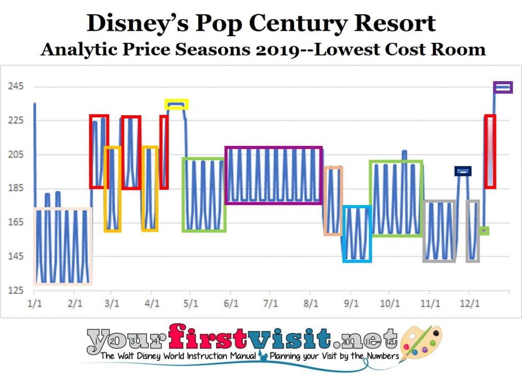
The values and moderates continue to operate to a different seasonal calendar then the deluxes between July and Thanksgiving but I did the exact same graphical analysis to uncover their seasons. Here’s an example of one of the moderates:
 …and of one of the values:
 If this is all too confusing, my travel agent partner Kelly can help you book during a lower-cost period. Contact her by using the form below.

Follow yourfirstvisit.net on Facebook or Twitter or Pinterest!!
June 25, 2018 No Comments