A Friday Visit with Jim Korkis: John Hench and Walt Disney World Color
By Dave Shute
Welcome back to Fridays with Jim Korkis! Jim, the dean of Disney historians, writes about Walt Disney World history every Friday on yourfirstvisit.net.
JOHN HENCH AND WALT DISNEY WORLD COLOR
By Jim Korkis
In 1990, I got to attend an event in Glendale, California where Imagineer John Hench lectured about color in the Disney theme parks. Hench worked for Disney for 65 years in a variety of capacities, especially when it came to design decisions utilizing color. Here is a short excerpt where he talked about his color choices at Walt Disney World.
“Color is an important part of every environment. Even as a kid, I was always aware that the amount of space occupied by a color was critical, and also the kind of light falling on the color.
“One of my favorite places in any of the theme parks in relation to color would be in Florida at the entrance of Epcot Center. Particularly the way it was when it opened with the marvelous jacaranda trees. Unfortunately, they froze in a big freeze in January 1983. They took out the jacarandas out and they weren’t replanted. The entrance would have been a very special paradise once a year with jacarandas and those beautiful blue-violet colors.
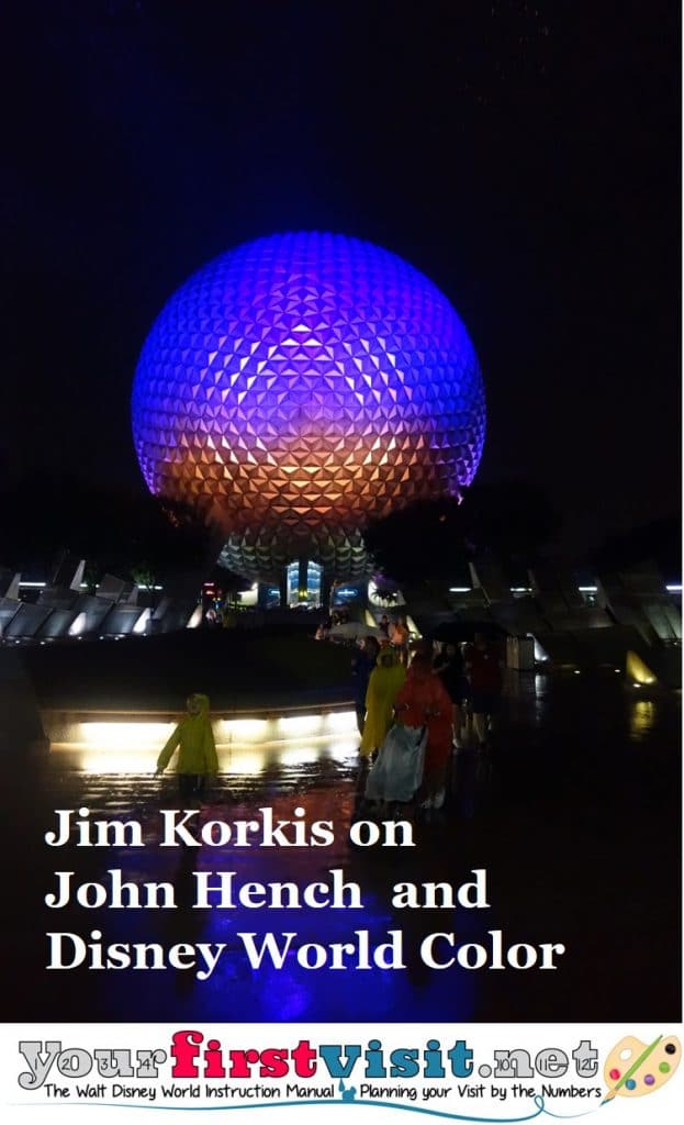
“Spaceship Earth picks everything up. We had a choice about that, and I was almost tempted to use gold but they wouldn’t guarantee the color. I thought it needed pattern but then again, we settled for this light and shadow. We had a difficult time with the night lighting. We couldn’t figure out a way to light the top of the sphere. We finally got two or three light sources high enough so we could put blue near the top. So the darkness seems to blend into the blue, then violet, and so forth – a particular spectrum. It worked.
“Another favorite use of color was for Journey Into Imagination in Future World. There were hard crystalline and geometric forms, and so many of them. I used a color that is associated with something much softer – a blue-violet. And then we concentrated a brighter color at the entrance, close to eye level. A flowering magenta bougainvillea hanging down over the doorway provided a combination of magenta and purple that was very intense. The rest of the pavilion sort of drifted away into paleness. You can do that with a color.
“For example, we used an entirely different color at the top of The American Adventure pavilion to imply that the huge fly-loft roof was located behind the building so you wouldn’t notice this big, awkward mass that fought with the architectural design of the building. It was kind of a greenish-grayish-bluish half tone with very little saturation.
“The American Adventure is quite a bit out of scale with its neighbors. The elaborate stage show demanded an exceptionally large stage, which in turn, called for a matching fly-loft of the roof of such proportion as to violate the classic Georgian-carpenter’s hall-colonial structure. So what to do? We used a wide colonnade at the base of the building, hiding the base line where the building meets the ground, reducing the apparent height of the structure.
“By high contrast, with straight white paint on the colonnade, the eye tends to stay on the lower areas, further reducing the apparent height. By successively lessening the contrast of the white window trim color with a little raw umber for each of the upper floors and topping finial towers, the adjusted contrasts seemed to pull the whole ensemble back in better relationship with the Japan and Germany pavilions.”
* * * * *
Thanks, Jim! And come back next Friday for more from Jim Korkis!
In the meantime, check out his books, including his latest, The Unofficial Walt Disney World 1971 Companion: Stories of How the World Began, and Secret Stories of Walt Disney World: Things You Never You Never Knew, which reprints much material first written for this site, all published by Theme Park Press.
Follow yourfirstvisit.net on Facebook or Twitter or Pinterest!!


1 comment
Very interesting read. I enjoy these Fridays with Jim articles.
Leave a Comment | Ask a Question | Note a Problem