DISNEY WORLD TEMPERATURES
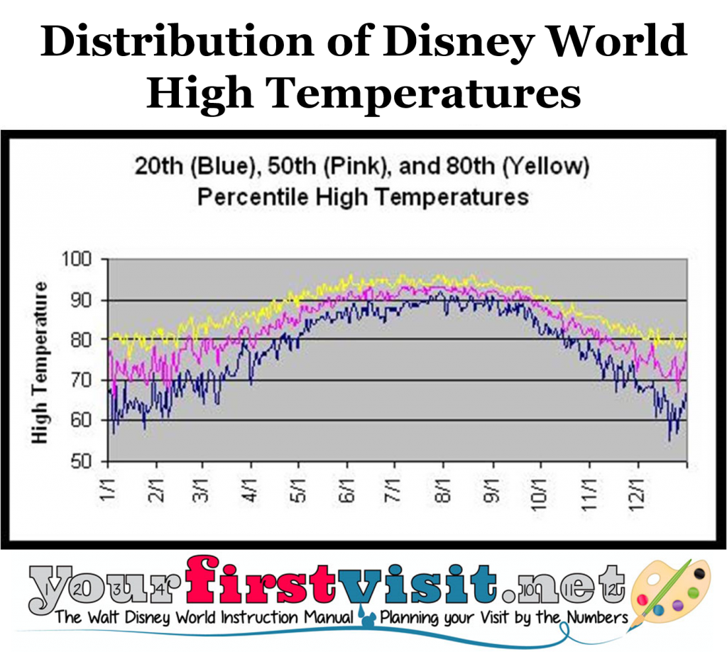
The chart shows Disney World high temperatures by day for the entire year.
It depicts 80th percentile, 50th percentile, and 20th percentile high temperatures, based on 20 years of weather data.
You interpret it most easily like this: for example, “On March 1, there is a 20% chance that the high temperature will be around or lower than 68, an 80% chance it will be higher than around 68, and a 20% chance it will be around 83 or higher.”
The key takeaway is that highs are not reliably (80% chance or better) above 75 between the beginning of November and the end of March…and that the summer is really hot…
Or here’s another way to think about the chart:
The pink line in the middle is the typical high temperature. Mathematically it’s the median, which means there’s a 50-50 chance the high will be lower or higher than the pink line.
Or to think another way, if you were there two days in a row, typically one day would have a high above the pink line, one a high below it, and the average of the highs of the two days would be the pink line.*
But that raises the question of how much above or how much below the pink line.
And that’s what the blue and yellow line are meant to communicate. The short version of the blue and yellow lines is that the closer together they are, the more likely the actual high temp will be pretty close to what’s signaled by the pink line. The wider apart they are–as they are in November through February–the more the highs can be well above, or well below, what the pink line expresses.
So here’s another way to think of it.
If you go on a five day trip, the odds are that three of the five days will have high temperatures between the blue and yellow lines, one day will have a high below the blue line, and one well have a high above the yellow line. And the average high of all five days will be the pink line!
The whole point of all this is that there’s broad stretches of the year when the “typical” (pink line) high temp can be a lot lower than, or a lot higher than, what you actually see!
*Yes I know average and median aren’t the same, and what I really should have said is that if you went the same day two different years rather than two days in a row, etc, but I’m looking for comprehensibility, not accuracy…since the data is continuous the second statement is fairly accurate, and because variability is fairly symmetrical around the mean, the median and mean are pretty close…
DATA SOURCES
All this site’s weather pages except for the material on cyclonic storms and on tornadoes are based on 20 years of data from the National Weather Service ending in December 2006. The cyclonic storm material is based on 30 years of data from Wikipedia. The tornado material is from NOAA/NCDC and goes from 1950 through October 2009.
ORLANDO WEATHER LINKS
- Weather and When to Go
- High Temperatures Year Round
- Average Rainfall by Arrival Date
- Hurricanes
- Tornadoes
- Chance of Winter High Temperature Over 75
- Pool Days November through February
Follow yourfirstvisit.net on Facebook or Twitter or Pinterest!!


555
Reply